
Research note · Performance measurement
Relative-Wealth Martin: when more return does not mean better performance
RWM compares compound growth over cash with drawdown in that same advantage—a simple way to distinguish an efficient curve from one whose return was bought too dearly.
The decision
1When does earning less mean performing better?
DBEU earned roughly 94% of SPY's CAGR with only 49% of its Ulcer Index. GDMN, by contrast, more than doubled SPY's CAGR but sustained over three times its deterioration. Which curve converted risk into return more efficiently?
CAGR automatically favours the highest return. RWM asks a different question: how much compound growth over cash did each curve produce per unit of drawdown in that same advantage?
Definition
2Three simple ideas, all calculated on one curve
1 · Relative wealth
Divide curve wealth by cash wealth. If one grows from 1 to 1.20 and cash from 1 to 1.10, relative wealth ends at 1.091: a cumulative 9.1% advantage.
2 · Relative CAGR
The annualised speed at which that advantage grew. Positive means beating cash; zero means matching it; negative means falling behind.
3 · Relative UI
The Ulcer Index summarises the depth and persistence of falls from prior highs in relative wealth. It is not general variability: it measures deterioration from the best level reached.
RWM divides relative growth speed by relative deterioration. An RWM of 1.30 does not mean a 130% return and is not a forecast: in the sample, relative CAGR was 1.30 times relative UI. For positive excess, a higher value means a more efficient combination.
RWM is a Martin variant calculated entirely on relative wealth. Its conceptual improvement is coherence: it does not compare a gain over cash with drawdown from a different curve, gross capital.
N/A. Near zero, a tiny excess can create an unstable score; require a minimum economically meaningful advantage before ranking.The key idea
3Measure the advantage, not only the capital
An investment can rise and still lose ground to cash. RWM therefore does not calculate drawdown on standalone capital: it first builds relative wealth.
When the curve rises
It is widening its edge over cash. Relative CAGR is positive when it ends the period ahead.
When the curve falls
It is giving back part of a previous advantage. Relative UI measures the depth and persistence of that deterioration.
Growth and drawdown now describe the same economic experience. That coherence—not the formula's complexity—is RWM's contribution.
The extreme case
4The 691 ratio that did not signal an extraordinary opportunity
SGOV barely experienced nominal declines. Its raw Ulcer Index was almost zero, so Martin divided a small difference versus cash by a microscopic denominator. Result: 691.6.
The number looks extraordinary, but it does not describe an extraordinary economic edge. It describes a nominal curve that almost never fell.
Conventional Martin
The numerator asks how much SGOV earned over cash. The denominator measures how far nominal capital fell from its highs. It compares two different experiences.
RWM
It calculates growth and drawdown on SGOV/cash. In this sample, SGOV did not beat the reference and its RWM was −0.27.
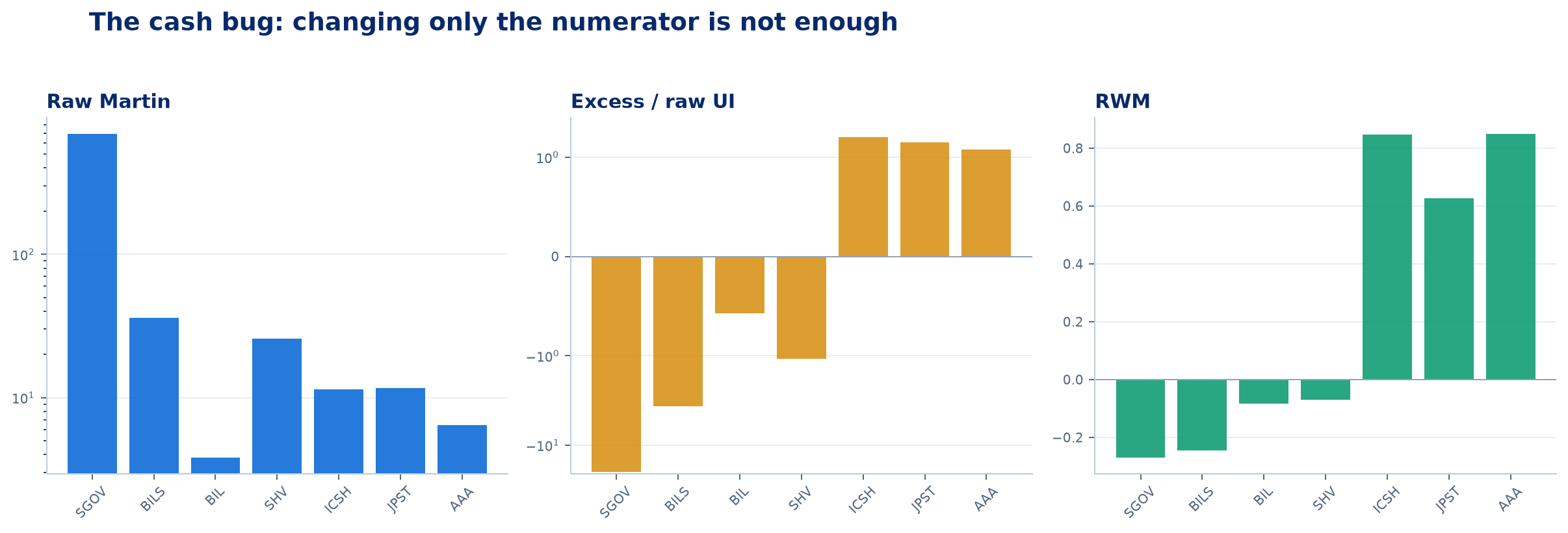
The scale accommodates Martin's extreme value. The important point is not merely that the number falls: measuring the actual edge over cash changes its interpretation.
The evidence
5What changes across 1,967 ETFs
Every curve was measured from 2022-03-01 to 2026-08-27. Identical dates prevent the quality of a curve from being confused with the market regime it happened to experience.
SGOV · The false giant
An almost zero nominal drawdown inflates Martin even when there is no edge over cash. RWM restores the economic meaning.
DBEU · Less, but better
It earned 94% of SPY's CAGR with roughly half its raw UI. RWM: 2.40 versus 1.30.
GDMN · More, too expensive
It more than doubled SPY's CAGR but sustained over three times its UI. RWM: 1.18, below SPY.
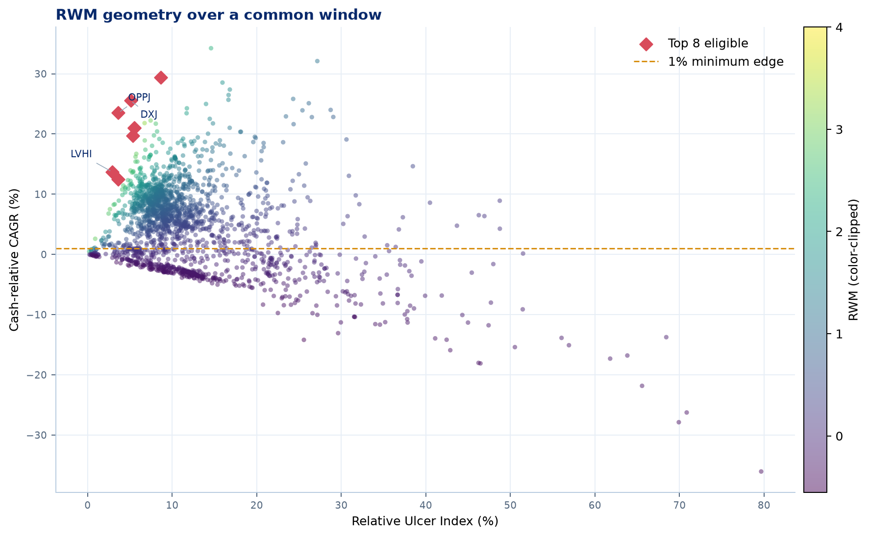
Each dot is one curve. Higher means more growth over cash; farther left means less relative deterioration. Rays from the origin join curves with equal RWM: a steeper slope represents a more efficient combination.
Appendix · View the top 15 curves with an annual edge above 1%
The 1% threshold is an illustrative convention, not a universal rule. In practice it should reflect costs, tracking, tax, and estimation uncertainty.
| Ticker | Product | Relative CAGR | Relative UI | RWM | Daily ES95 |
|---|---|---|---|---|---|
| OPPJ | WisdomTree Japan Opportunities Fund | 23.52% | 3.63% | 6.48 | −2.57% |
| DXJ | WisdomTree Japan Hedged Equity Fund | 25.55% | 5.08% | 5.03 | −2.75% |
| LVHI | Franklin International Low Volatility High Dividend Index ETF | 13.70% | 2.91% | 4.71 | −1.60% |
| DBJP | Xtrackers MSCI Japan Hedged Equity ETF | 21.00% | 5.51% | 3.81 | −2.82% |
| HEWJ | iShares Currency Hedged MSCI Japan ETF | 21.00% | 5.52% | 3.80 | −2.80% |
| FLJH | Franklin FTSE Japan Hedged ETF | 19.71% | 5.34% | 3.69 | −2.73% |
| HEFA | iShares Currency Hedged MSCI EAFE ETF | 12.43% | 3.62% | 3.43 | −2.00% |
| GREK | Global X MSCI Greece ETF | 29.40% | 8.62% | 3.41 | −3.42% |
| DBEF | Xtrackers MSCI EAFE Hedged Equity ETF | 11.95% | 3.62% | 3.30 | −2.00% |
| EWP | iShares MSCI Spain ETF | 21.81% | 6.73% | 3.24 | −2.81% |
| EUFN | iShares MSCI Europe Financials ETF | 22.23% | 7.44% | 2.99 | −2.95% |
| AMUB | UBS ETRACS Alerian MLP Index ETN Series B | 16.70% | 5.75% | 2.90 | −2.75% |
| MLPB | UBS ETRACS Alerian MLP Infrastructure Index ETN Series B | 16.21% | 5.66% | 2.86 | −2.71% |
| ATMP | Barclays ETN+ Select MLP ETN | 18.93% | 6.75% | 2.80 | −3.20% |
| FFLC | Fidelity Fundamental Large Cap Core ETF | 13.95% | 5.07% | 2.75 | −2.41% |
Versus other ratios
6When Sharpe, Sortino, and Calmar tell a different story
GDMN looks slightly better than SPY on Sharpe (0.82 versus 0.68), Sortino (1.16 versus 0.98), and Calmar (0.71 versus 0.70). RWM reverses the order: 1.18 versus 1.30. The disagreement is not an error; each ratio answers a different question.
Sharpe and Sortino
They relate excess return to return dispersion. They are useful when volatility is the chosen definition of risk.
Calmar
It divides CAGR by one maximum drawdown. It captures the worst episode, but not how long or often drawdowns persisted.
Conventional Martin
It uses Ulcer Index but can mix excess over cash in the numerator with nominal drawdown in the denominator.
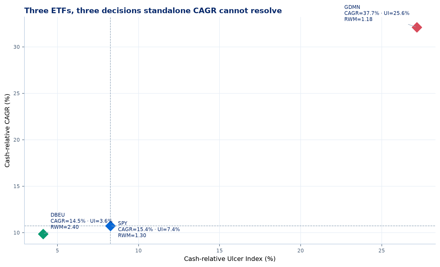
DBEU shows that accepting slightly less CAGR can greatly improve efficiency. GDMN shows that a large return may have been bought too dearly.
| Case | ETF | CAGR | Raw UI | Sharpe | Sortino | Calmar | Martin | RWM |
|---|---|---|---|---|---|---|---|---|
| SPY · reference | SPY | 15.4% | 7.4% | 0.68 | 0.98 | 0.70 | 1.45 | 1.30 |
| ≈94% of SPY CAGR, ≈49% of its UI | DBEU | 14.5% | 3.6% | 0.73 | 1.06 | 0.95 | 2.74 | 2.40 |
| >2× SPY CAGR, >3× its UI | GDMN | 37.7% | 25.6% | 0.82 | 1.16 | 0.71 | 1.26 | 1.18 |
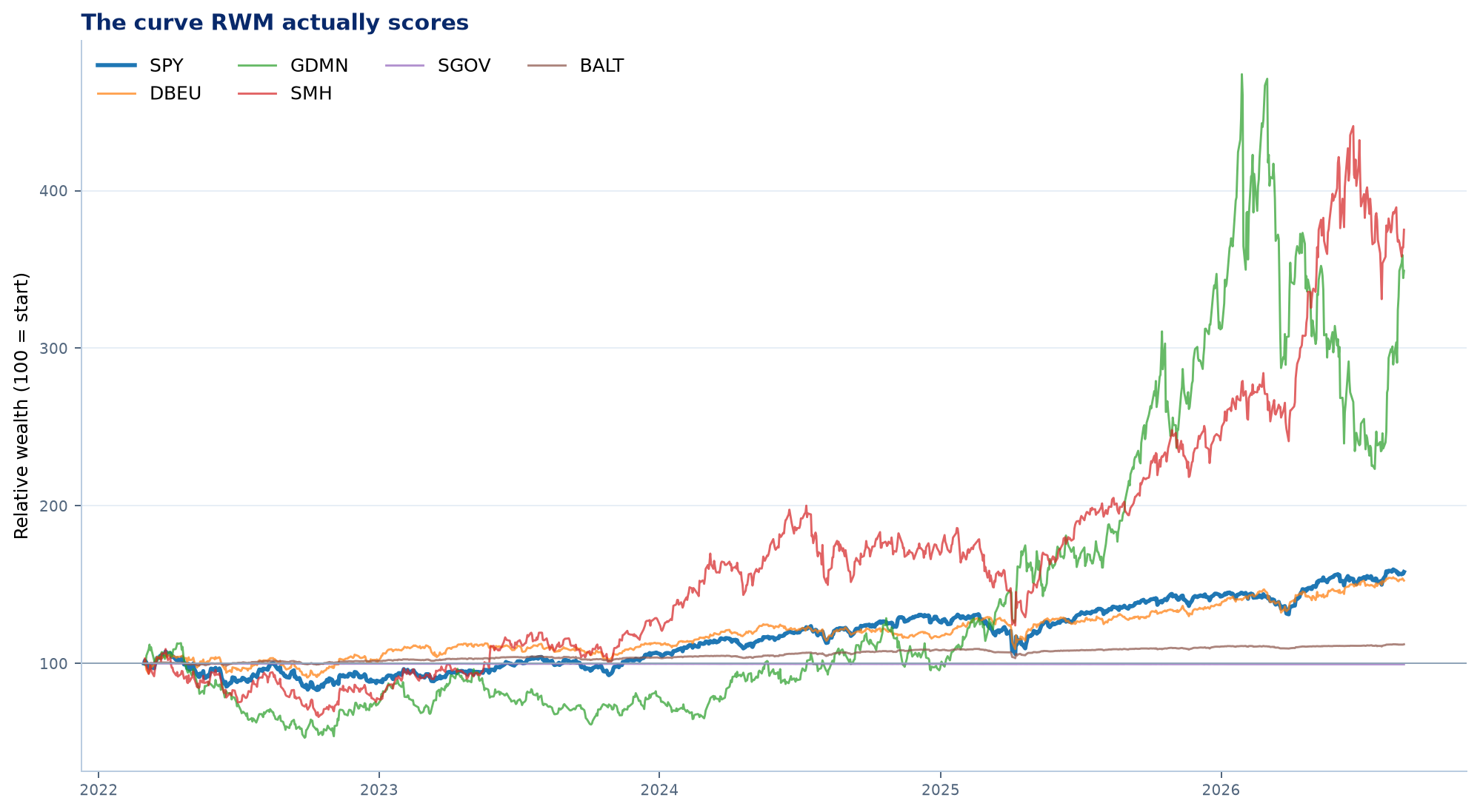
RWM scores these curves versus cash. An asset can rise nominally while losing relative ground.
A useful ranking property
If B has more relative CAGR and less relative UI than A, RWM will always rank B higher. The table contains cases where a conventional ratio prefers A even though B is better on both dimensions RWM measures.
| Conventional ratio | Prefers A | Ratio A | Rel. CAGR A | Rel. UI A | RWM A | B dominates | Ratio B | Rel. CAGR B | Rel. UI B | RWM B |
|---|---|---|---|---|---|---|---|---|---|---|
| Sharpe | FLRT | 1.00 | 2.4% | 2.2% | 1.10 | IGHG | 0.57 | 2.8% | 1.9% | 1.49 |
| Sortino | CRAK | 1.29 | 17.8% | 14.8% | 1.20 | ATMP | 1.27 | 18.9% | 6.8% | 2.80 |
| Calmar | MSMR | 1.27 | 6.7% | 4.4% | 1.53 | DBEF | 1.14 | 12.0% | 3.6% | 3.30 |
| Martin · exceso/UI bruto | SDCI | 1.74 | 13.0% | 9.6% | 1.35 | USXF | 1.70 | 13.4% | 8.6% | 1.56 |
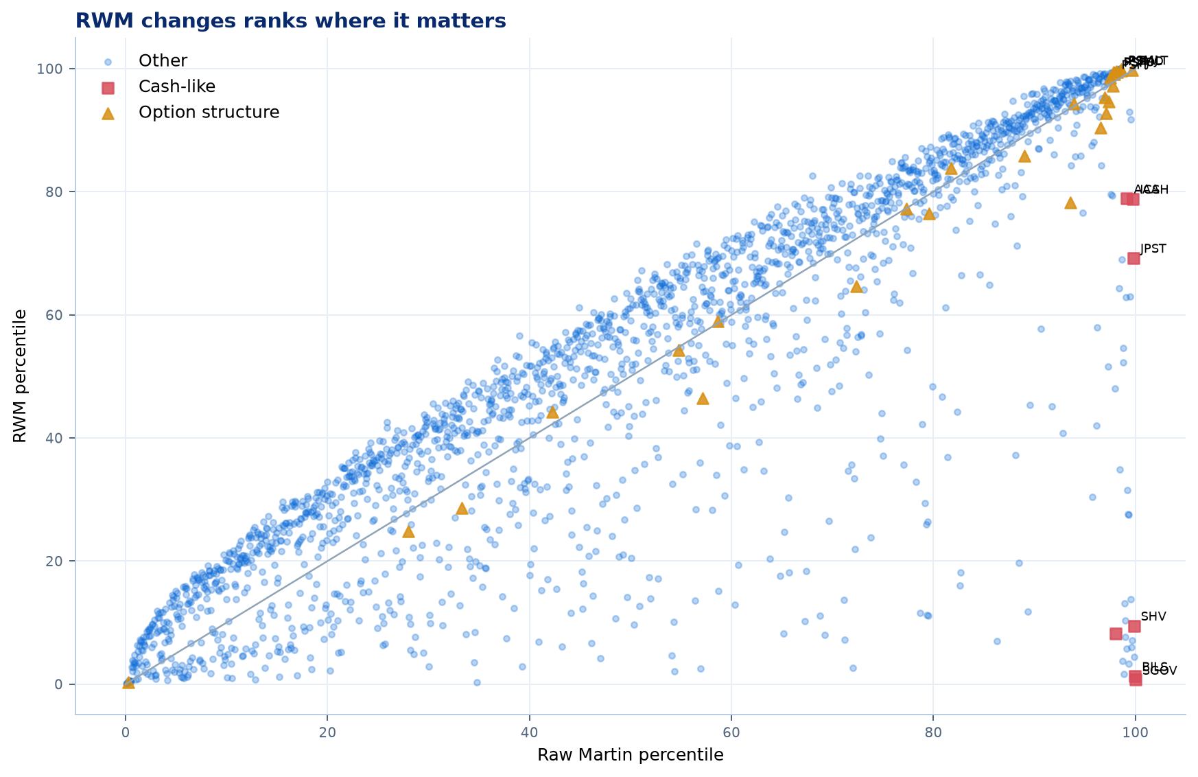
The diagonal means identical order. Moving away from it identifies curves whose interpretation changes when both growth and drawdown are measured versus cash.
Persistence
7RWM showed the strongest persistence under its own criterion
We calculated Sharpe, Sortino, Calmar, Martin, and RWM over three five-year periods, then evaluated each ranking over the following five years. The samples contained 519, 755, and 1,023 ETFs. Future data judged the rankings; they never built them.
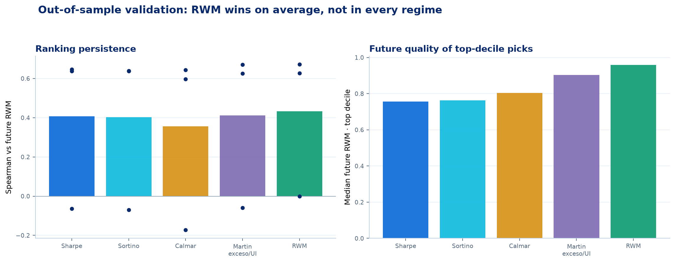
RWM had the highest mean relationship with subsequent RWM: 0.433 versus 0.412 for Martin, 0.407 for Sharpe, 0.402 for Sortino, and 0.356 for Calmar. RWM's top decile also achieved the highest median future RWM: 0.96.
| Metric | Future Spearman | Future RWM · top decile | Top-quintile hit rate | Future relative CAGR | Future relative UI |
|---|---|---|---|---|---|
| Sharpe | 0.407 | 0.76 | 40.5% | 5.9% | 10.6% |
| Sortino | 0.402 | 0.76 | 40.9% | 6.3% | 10.5% |
| Calmar | 0.356 | 0.80 | 43.7% | 6.7% | 9.8% |
| Martin · excess/raw UI | 0.412 | 0.90 | 49.0% | 7.3% | 9.6% |
| RWM | 0.433 | 0.96 | 50.3% | 8.4% | 9.7% |
Show stability rather than hiding it in another number
Rolling 756-session windows reveal dependence on the entry date. Because they overlap, they are not independent tests and should not be compressed into another score.
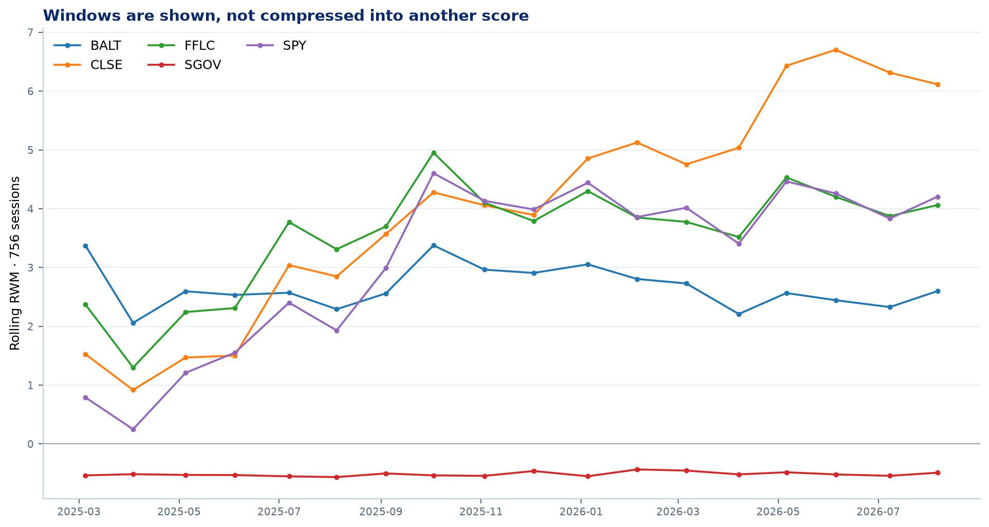
SPY and four examples show how RWM changes with the period analysed.
How a minimum edge over cash changes the ranking
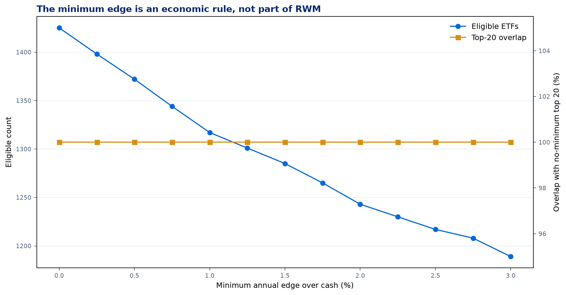
The minimum edge changes which curves enter the comparison. It is a practical rule—dependent on costs and uncertainty—not part of the formula.
Practical use
8How to use RWM in a real comparison
Prepare and rank
- Compare equivalent histories: same currency, frequency, start date, and end date; known costs included and one cash reference.
- Always show three figures: RWM, relative CAGR, and relative UI. This reveals where the score comes from.
- Require a material edge: if growth over cash does not cover costs and estimation error, there is not enough evidence to rank.
Interpret before allocating
- Do not automate the conclusion: higher RWM describes greater sample efficiency, not higher future return.
- Treat close values as equivalent: if a small date change reverses the order, there is no robust winner.
- Review unseen risk: options, leverage, concentration, capacity, liquidity, execution, and tail losses require separate analysis.
Conclusion
9Not the holy grail. A clear answer to a useful question.
RWM shows which curve converted its edge over cash into compound growth with less deterioration in that same advantage.
What it contributes
- Stops a near-cash curve from looking exceptional because nominal drawdown is almost zero.
- Resolves comparisons such as DBEU versus SPY or GDMN versus SPY transparently.
- Keeps both pieces of the result visible: relative CAGR and relative UI.
What it cannot do
- Predict which curve will earn more next year.
- Discover risks that have not yet materialised.
- Replace Sharpe, Sortino, or Calmar when the question is different.
Methodology, cash, and sources
USD cash uses FRED's daily Effective Federal Funds Rate (DFF), accrued over calendar days without a spread on an Actual/360 basis. Cash accrues over weekends and holidays, then aligns to each curve's dates. Both wealth indices start at 1 on the same date.
The public implementation fixes USD cash. Direct comparison with a risky benchmark such as SPY mixes skill and beta; that extension requires neutralising market exposure first.
Historical Ulcer Index and UPI definition: Peter G. Martin. Standard Martin convention: PerformanceAnalytics. Example prices: Yahoo Adj Close from the local Qinvia cache. Daily data; 365.2425-day years; distributions included to the extent reflected by Adj Close.
Martin (1987), The Investor's Guide to Fidelity Funds · PerformanceAnalytics manual · FRED DFF
Generated 2026-08-30 10:53 UTC. 0 cases with numerically zero relative UI are marked N/A. Code and derived data are prepared for a public repository; raw Yahoo prices are not redistributed.
GitHub
Methodology, implementation and reproducible materials.
The public repository preserves the implementation, tests, derived data and bilingual reports. This web publication retains the complete formulas, figures, tables, results, limitations and conclusion.
GitHub Code and reproduction